DISTEVAL: Protein Distance Evaluation

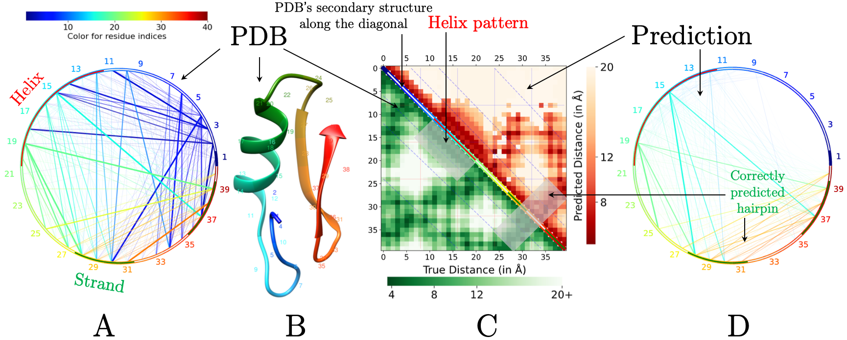
(A) Chord diagram of input PDB structure. The arch of the chord diagram shows the secondary structure labels by DSSP11 (helix in red, coil in white, and strand in green). Chord widths and transparency correspond to the actual physical distances (smaller distances have larger widths and lesser transparency) and chord colors are based on residue index number—red through green to blue. (B) The corresponding PDB file. (C) Heatmap diagram comparing the predicted contactmap in the upper triangle with the PDB distance map in the lower triangle. The colors in the diagonal line of the heatmap show the DSSP assigned secondary structures (helix in red, coil in white, and strand in green). (D) Chord diagram of the predicted contact map; chord widths correspond to the predicted contact confidence. The chord diagram (in D) and the heatmap (in C) clearly highlight the patterns such as strand-strand interaction.

What is Long-range?
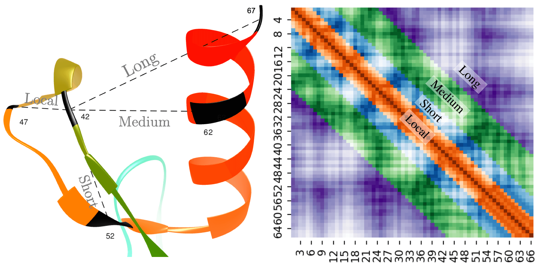
Example of long-range, medium-range, short-range, and local distances in a protein distance map. The distances between residue pairs 42-47, 42-52, 42-62, and 42-67 are examples of local, short, medium, and long-range contacts, respectively (left). In the heatmap plot (right), the sequence separation domain for long, medium, and short-range distances, as well as local distances are [24+], [12, 23], [6, 11], and [0, 5], respectively. The labels in the x and y axis refer to the residue index in the corresponding protein sequence. The diagonal line shows that the residue pair i and i have a zero distance.
Pixelwise Error Comparision
The figure in the left is the plot showing the predicted input distance map in the upper half triangle and the true distance map from PDB in the lower half triangle. The figure on the right shows the absolute error between each pixel of the upper half and lower half. That is it shows how different are the distance between residues in the prediction versus the actual. The green region in the figure is the connections that have very little difference between predicted and actual while the red regions are the ones that have larger differences.

Pearson's correlation coefficient of metrics used for evaluation of predicted real-valued distances with TM-score and GDT-TS score, calculated on the PSICOV 150 protein dataset. Models were reconstructed using CONFOLD and top-one model was selected for evaluation.

Heatmap Diagram
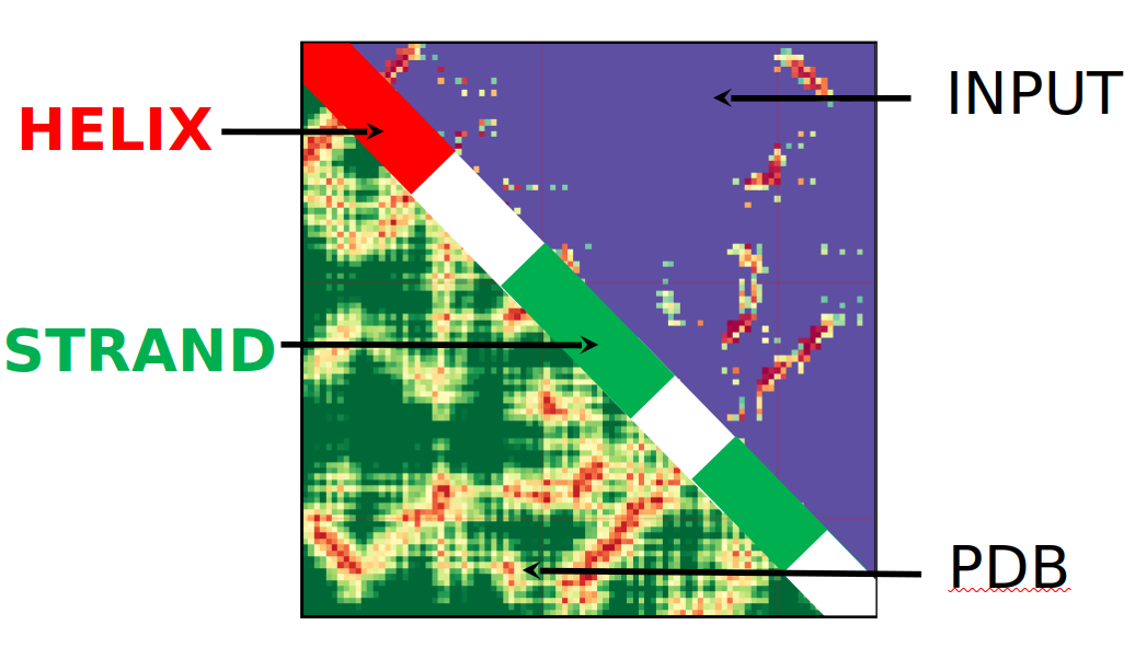
The heatmap diagram is designed to show the differences between predicted connections and those of the PDB file that behaves as the ground truth value. If both a PDB and an RR file are present another heatmap is present showing the differences between the PDB and submitted RR file on a logarithmic scale. The top, or upper right triangle, will be the input RR file that you provide, while the lower left triangle will be the PDB or true structure. As it is a heatmap, the closer to red the color is the closer the contact is, the closer to blue the further apart two residues are. There is a legend that appears on the right hand side of the diagrams that better shows how the colors correspond to individual distances. The diagonal also has meaning, with red indicating that a helix is present, and green representing a strand. When the diagonal is white it indicates that neither a helix or strand is present.

Chord Diagram
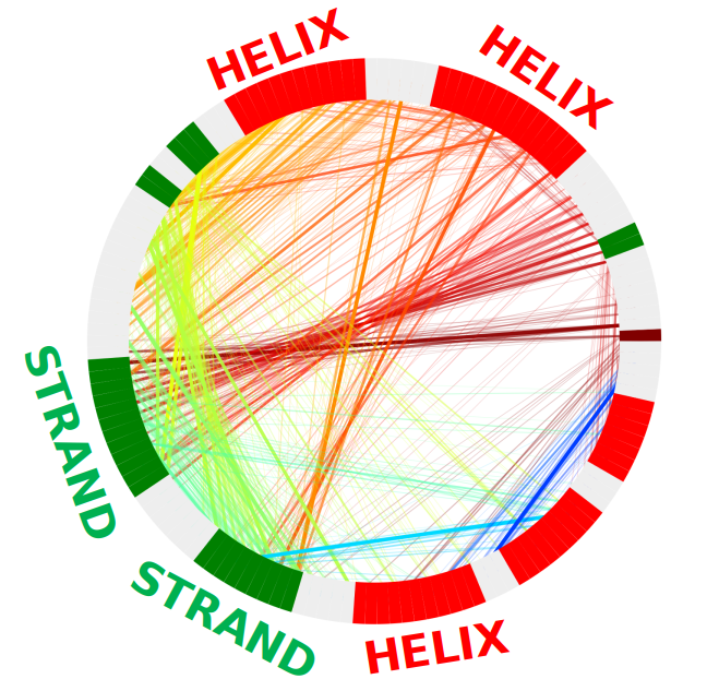
The chord diagram is designed to show connections that are present. The thickness of the line represents the how far apart the residues are with the thicker the line the closer the two residues are, or how confident the prediction is in that particular connection depending on the type or RR file received. Bundles of strands indicate that there is a large grouping between these two residue areas. When the strands are thin it represents either a low confidence prediction or that two residues are far apart, i.e. there is little interaction. The red areas around the edge represent helices while the green represent strands.

Distancemap
The distance map is designed to show the distances between residues in a way that is easy to understand. The closer that a color is to light red the further away those two residue contacts are while a color close to red indicates that two residues are close to each other. There is a legend that appears on the right hand side of the diagrams that better shows how the colors correspond to individual distances. The red line on the diagonal represents a helix while the green line represents a strand.
Note: This server has been tested and works well in Chrome, Safari, Microsoft Edge and Mozilla Firefox browser.